Bang & Olufsen
art direction
graphic systems
typography
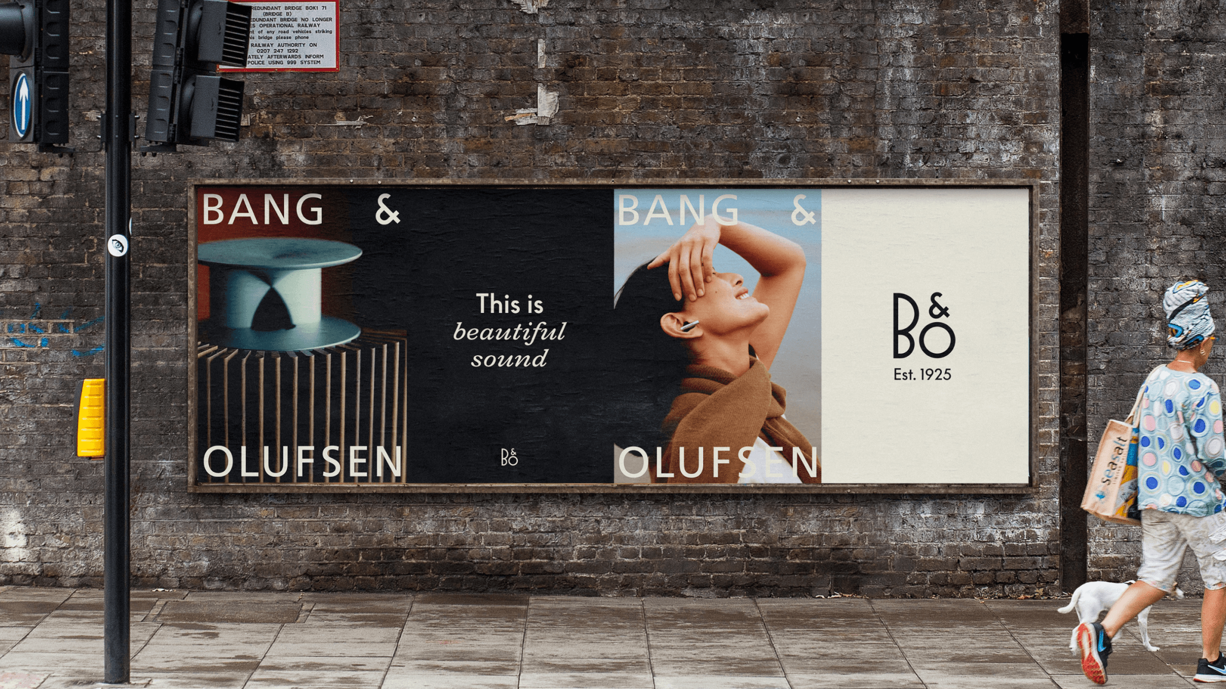
Bang & Olufsen set out to evolve its visual identity beyond the conventions of consumer electronics, creating a brand world that could express sound as something emotional, tactile and deeply human.
I helped develop a richer visual system built around the idea of Beautiful Sound. The art direction introduced warmth, movement, eclectic interiors and analogue-inspired photography, placing products naturally within lived-in environments rather than treating them as isolated objects. The identity also expanded the role of the logo, using oversized and unconventional applications to give the brand a more expressive cultural presence.
The wider system brought together refined typography, expressive display type, a distinctive heritage-led colour palette and recurring material cues drawn from aluminium, wood and circular forms. I worked across the visual identity, art direction and graphic system, helping create a more immersive and emotionally resonant expression of Bang & Olufsen's design heritage.